Hey guys,
Not sure if you can help me…
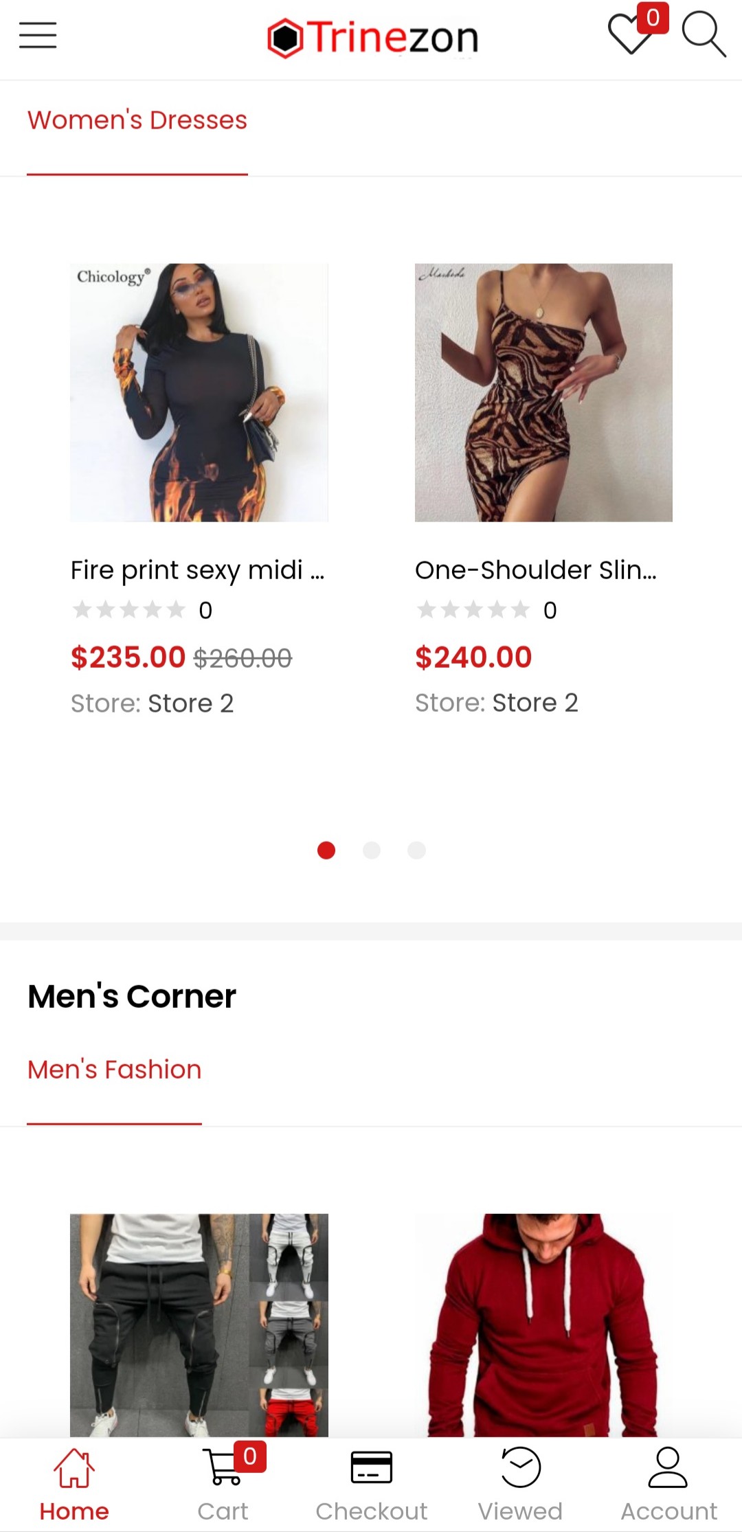
I’ve decided to include a quick access menu for the homepage that allows the visitors/shoppers to jump to particular sections of the homepage. In order for it to be practical I have to make it stick to the header. I currently have the Besa header visible.
I’ve added the css that enables scrolling and in elementor I have made the section stick to top when it reaches there. It works fine on computer mobile view but not on my phone.
Maybe there’s something I can add to the css?
CSS:
selector ul{
white-space: nowrap;
overflow-x: auto;
overflow-y: hidden;
flex-wrap: inherit !important;
scrollbar-width: none;
}
selector a{
background: #408130;
border-radius: px;
}
selector ul::-webkit-scrollbar {
display: none; }
On phone:

Elementor:
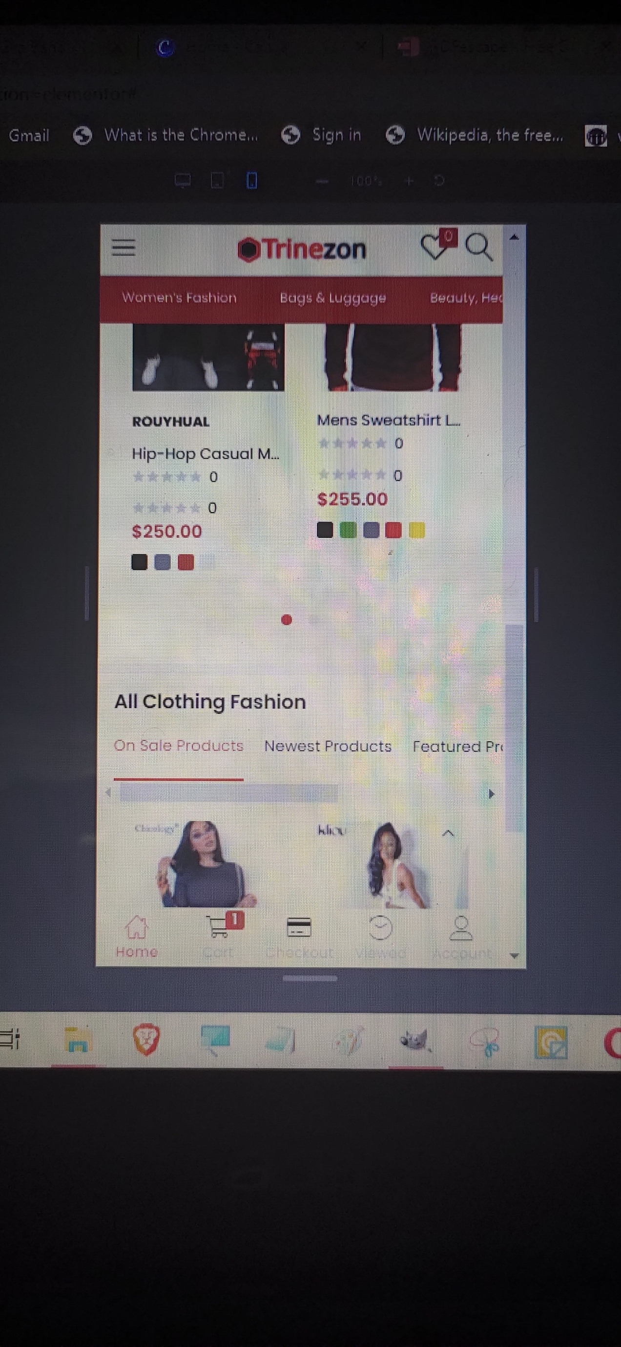

I’ve made the offset effect to 45px to allow it to sit under the header.