A week ago I added a topic, but it was deleted, which is ugly for me !
I bought the theme from the very beginning and I no longer have support, but I also don’t want you to code or do anything special for me
the problem is this when I set up the theme from the Voocomerce /shop/Shop Layout and choose (no sidebar)
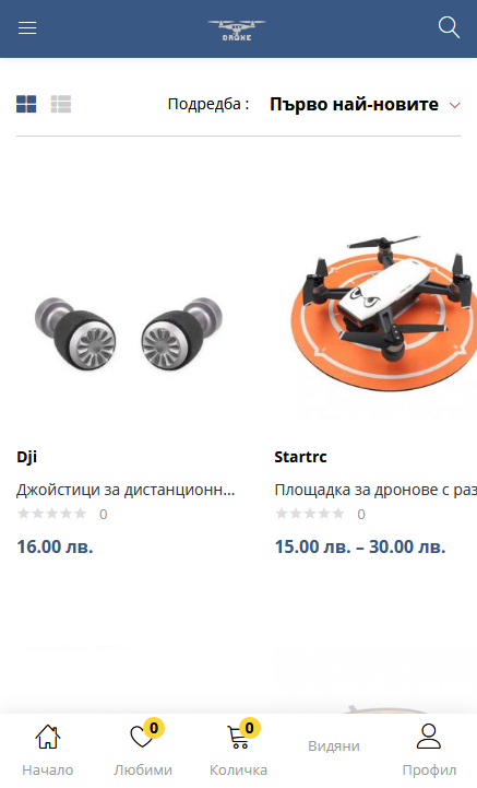
my mobile view is broken, there is no problem in the store page, but when I enter the product category, the pages shift ?
Have you updated to the latest version of the theme yet? Can you send your website link for me to check?
yes updated to a new version, I try with a clean installation locally but again
I made a video so that you can understand me more easily because of my bad English this problem appears only on certain pages in the product categories, I do not know what the algorithm is, but on one page it is good the column on the other is damaged. this problem does not exist, only the categories
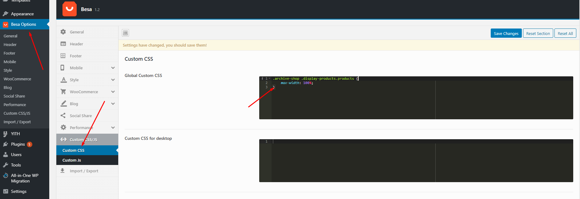
yes this solves the problem, thanks a lot!